Applications for Potentiometric Maps
Potentiometric head data can easily be used to map trends in the water levels of a region and the properties of an aquifer. As an example, I have chosen the Ogallala aquifer of the High Plains, where significant groundwater declines have occured since pumping began in the 1940's.
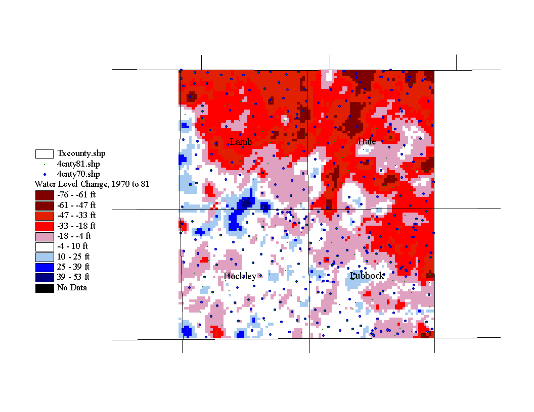
Here is a map of net water level changes in Lubbock, Hockley, Lamb, and Hale counties from January 1970 to January 1981.
Map of Water Level Change, 1970 to 81
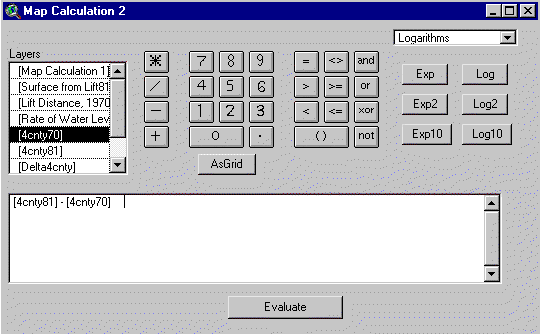
This map was generated with map calculator by subracting the Jan. 1970 potentiometric map from the Jan. 1981 potentiometric map, i.e. the water elevation value of each cell of the 1970 map was subtracted from each cell value of in 1981 map. You will find map calculator in the Analysis menu. Again, Spatial Analyst must be active in order to perform this function. Below is the map calculation that produces the above map.
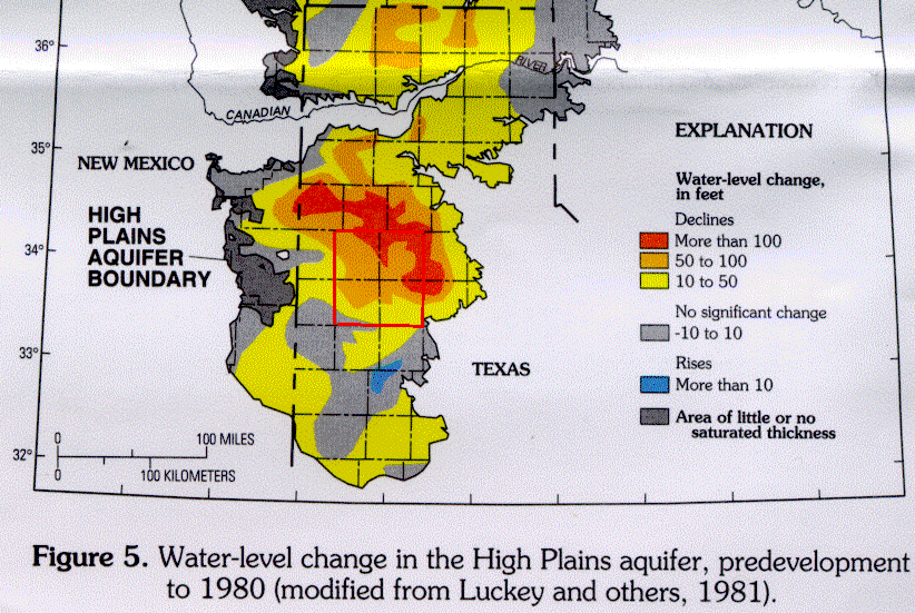
Map of Water Level Change, Predevelopment to 80
I obtained this map from the USGS Water Resources Investigations Report #95-4208, "Water Level Changes in the High Plains Aquifer-Predevelopment to 1994". Although the time period represented by the previous map is 1970 to 80, it is interesting to note that the general trends agree well. In both maps, water level declines are greatest in the northeastern portion of the study area than in the southwestern section.
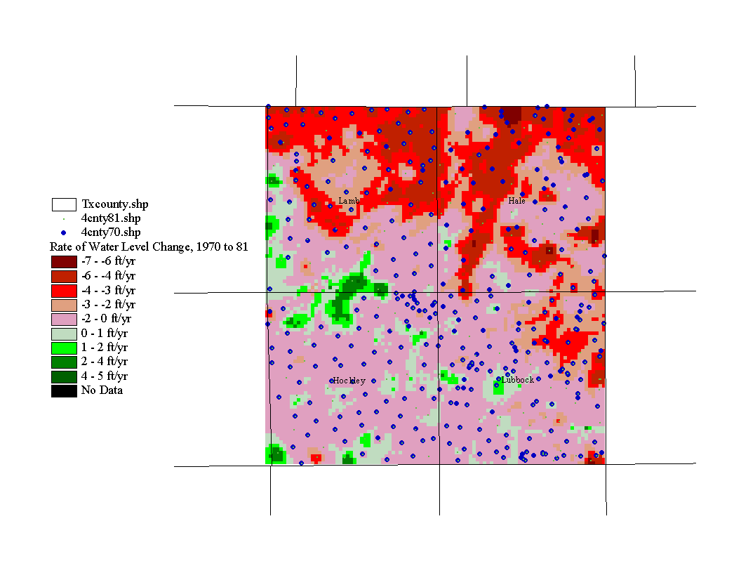
The next application is similar to the first. It is a map of the rate of water level change for the same area, during the same time period. In map calculator, the 1970 map is subtracted from the 1981 map as before, but now this quantity is divided by 11 years. Each cell now has a value that is the rate of water level change in feet per year.
Map of Rate of Water Level Change, 1970 to 81
The next application is a map of saturated thickness. Since the Ogallala is an unconfined aquifer, the water table is the upper bounding surface of the aquifer. The lower bounding surface is the contact with underlying Cretaceous and Triassic units. The thickness of the aquifer is simply the distance from the water table to the lower bounding surface of the Ogallala, but it does not closely resemble the water table map because the Ogallala was deposited on a rough surface with hills and stream valleys.
Map of Saturated Thickness, 1970
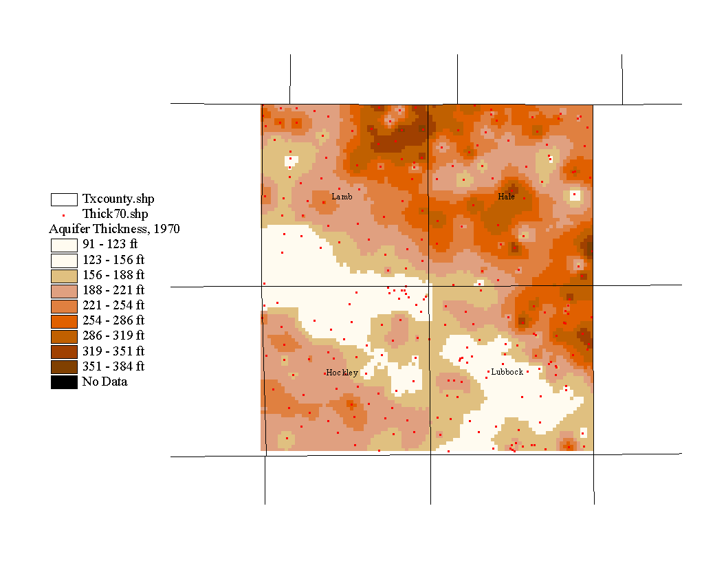
This map is merely a demonstration of the method that would be used to construct an aquifer thickness map, but probably a poor representation because the well depths were assumed to represent the depth to the bottom of the aquifer. This assumption was made because because it would have been extremely time consuming to obtain the well logs and enter the aquifer depth data by hand.
In order to prepare the data file for the thickness map, I exported the 1970 attribute file into Excel, deleted all entries without well depth data, converted the well depths to elevations, subtracted the well depth elevation from the corresponding water level elevation, and subtracted the well depth from the water elevation. Then the file was added to the veiw in Arcview and a surface was generated as before.
I initially tried to make an aquifer thickness map by generating a map of the lower bounding surface of the aquifer and subtracting it from the potentiomtric surface, but this yielded some negative values. This is probably because the well depth entries do not always represent the actual depth of the aquifer, as well as the fact that the interpolated surfaces may intersect in areas where there are few data points to constrain the interpolation.
The next application is a map of the volume of water in storage in the Ogallala aquifer during January 1970.
Map of Aquifer Storage, 1970
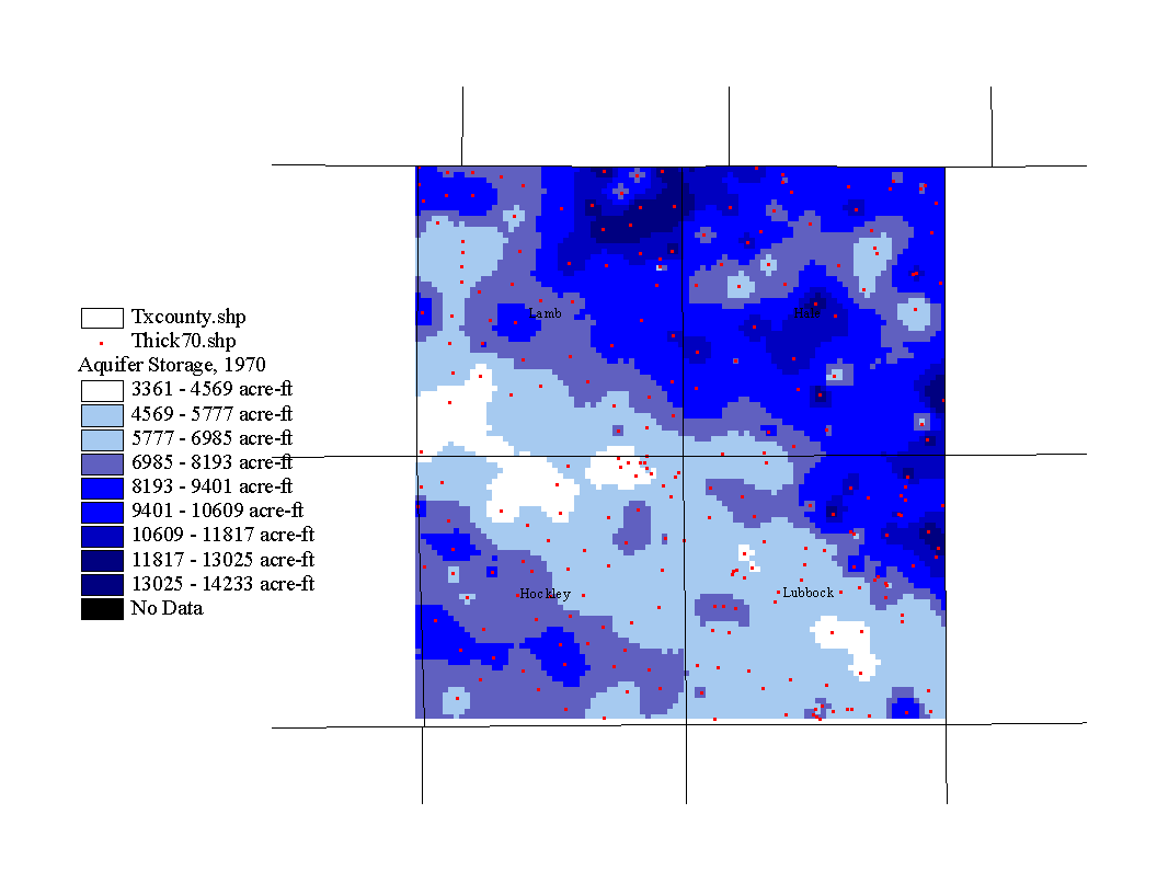
The volume of water stored in an aquifer is simply the volume of the aquifer times the specific yield. The specific yield is the drainable portion of the pore water where porosity=specific yield + specific retention. The specific retention is that portion of the pore water that is held in contact with the mineral grains and cannot be drained; thus, it is not included in the storage calculation (Fetter, 1994). Now the new map can be generated in map calculator. The calculation is as follows: (("aquifer thickness map") x (cell area) x (specific yield) x 0.3048) / 1233. You can determine the cell area by clicking on any cell with the information tool. I used a specific yield value of 15% as in Bell and Morrison, 1978. The number 0.3048 is a conversion factor from square meters to square feet. The number 1233 is a conversion factor from cubic feet to acre-feet.
Another important application is a map of the distance from the surface to the potentiometric surface, or in this case, water table. This lift distance determines how much energy is required to pump water to the surface. As the water table falls, the lift distance increases and so does the energy needed to lift the water. This means that a consequence of pumping is that the more water that is pumped, the more expensive it becomes to pump more water (Bell and Morrison, 1978).
In order to generate the following map, I first selected those data points in the 1970 well coverage that intersect the 1981 well coverage so that I could compare the change in lift distance from 1970 to 1981. The procedure for selecting intersecting data points is as follows: with the theme active go to the theme menu: Theme/Select by Theme, under select features of active theme that select intersect, under the selected features of select the file that should have intersecting features with the active theme, then in the theme menu: Theme/Convert to Shapefile. Now you can use the new theme to generate the lift map with the procedure described in the previous section "Potentiometric Map Construction".
Map of Lift Distance, 1970
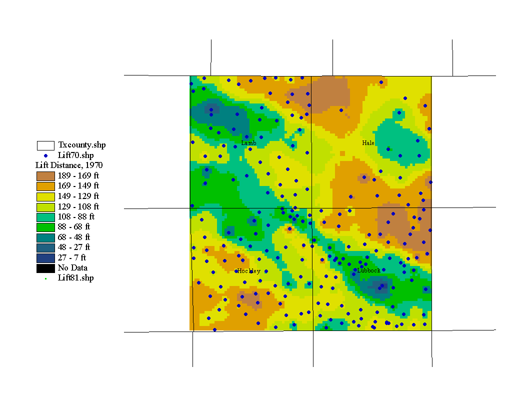
According to the above map, it should be cheaper to pump water in the city of Lubbock than in northeastern Lubbock county.
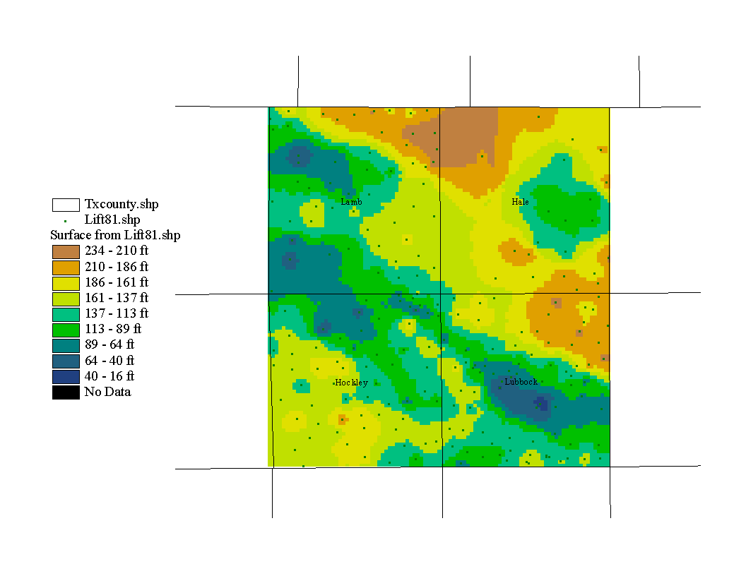
The next map is the same as the previous one except that the data set is from January 1981. As before, those data points that intersect 1970 were selected to create a new data set that can be compared with the above map.
Map of Lift Distance, 1981
The next map is the change in lift distance from 1970 to 81. It is similar the map of water level change except that it depicts the change in the lift distance and thus the change in the amount of energy required to lift water to the surface.
Map of Change in Lift Distance, 1970 to 81
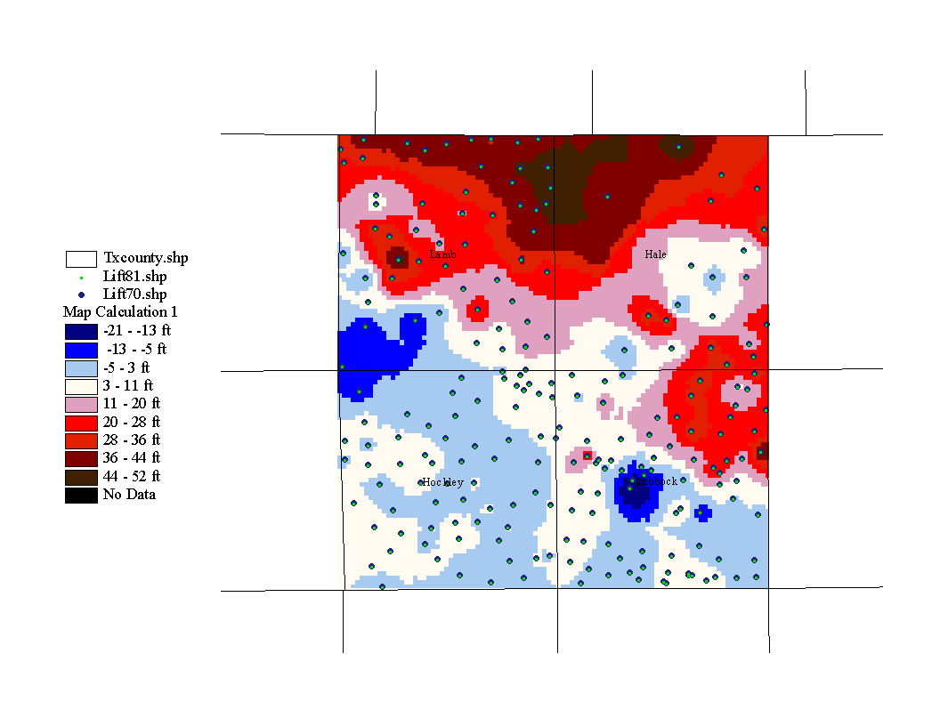
The red values represent increased lift distance and the blue values represent decreased lift distance. According to the above map, the lift has increased by up to 52 feet in the northern section of the study area, making pumping more expensive in that region.