Fourier Analysis of Water Quality Data
Using Excel Spreadsheet Software
Theory
If it is desired to study the cyclical behavior over time of a water quality variable the fourier analysis is an effective tool to utilize. The cyclical behavior could be diurnal, seasonal or man-made. The periodic function may be responding to temperature, sunlight, releases from dams, etc. This form of analysis can be an effective tool for predicting the behavior of the variable of interest or it could be used to compare to independent sets of data.
The fourier technique is a form of multiple regression analysis. The cycle is described by a sine function with the general form of:
![]()
For the seasonal variation over a period of years the function takes the form:
![]()
where: t = Julian days
y = water quality parameter
This is the form that will be used to analyze the variation of dissolved oxygen with the seasons in the example below.
Set-Up
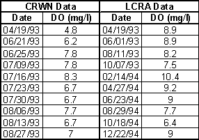
The fourier analysis will now be used to compare two data sets with cyclical behavior and as a tool for predicting the variable where data is missing. The variable is dissolved oxygen measured by volunteer monitors (set 1) and professional monitors (set 2) at approximately the same location on the Colorado River. The raw data has the following form:
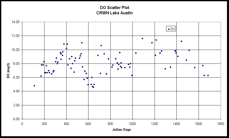
A scatter plot of the data shows the cyclical nature of the data:
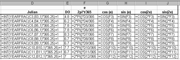
A spreadsheet for each data set is structured as follows in Excel:
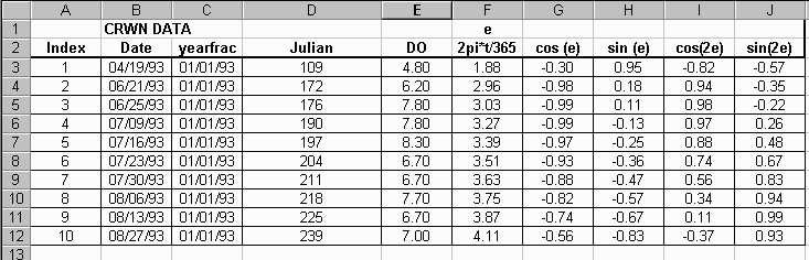
Column C is used as a reference date used in the formula, yearfrac, for determining the Julian day. The formulas used in colums D through J are:
Now the regression analysis can be performed. The goal is obtain the values for the coefficients ao, aj and bj in the regression formula and to see how well the calculated curve fits the data. Under the Tools Menu go to Data Analysis and choose the Regression tool:
The regression tool window will look like this:
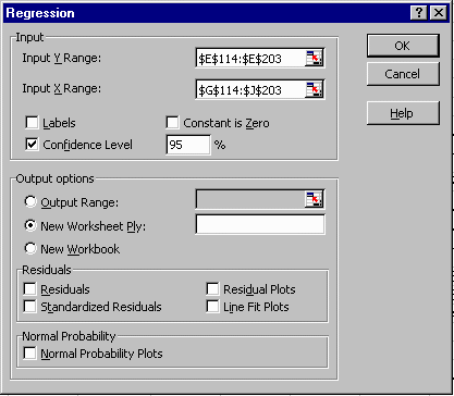
The Input Y Range is the column with the dissolved oxygen data and the Input X Range is the field with the values of the sine and cosine functions. The output of the regression analysis has the following form:
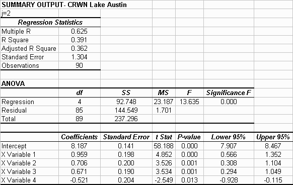
For this example the coefficients for the regression formula are: ao=8.1869 mg/l, a1=0.9690 mg/l, b1=0.7056 mg/l, a2=0.6713 mg/l, b2=-0.5212. The ao value can be interpreted as being the mean value of DO as determined by the regression. So the formula for the best fit line for this set of data is:
![]()
The t-stat values for each variable having an absolute value of greater than 2 indicates that each factor in the equation is contributing significantly to fit of the line. In this case a check into whether you would get a better fit expanding the equation to j=3 would be worthwhile. The results are as follows:
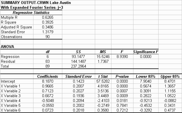
The absolute value of the t-stat for variable 5 and 6 are much less than 2 indicating that the addition of these factors did not contribute significantly to the fit of the line.
Graphically the results have the following form:

It can be seen how expanding the equation to j=3 did not help with the fit of the line to the data. The same procedure can now be done to the LCRA data.
Compare the two data sets
A smooth best-fit line can now be produced for each data set and the
two best-fit lines can be compared graphically. Set up another Excel spread
sheet with uniform time intervals (7days in this example). 
The plot of the two best-fit lines (click on thumbnail):
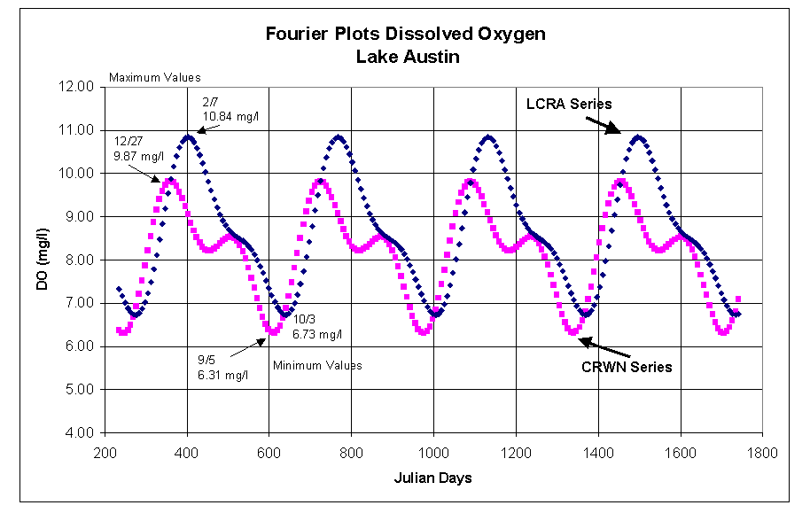
It can be seen that each best-fit line has the same general form but there is a significant phase shift between the curves and the values of the predicted maximum and minimums. The predicted time of times and magnitudes of the maximum and minimums are indicated on the graph. For these particular data sets there is a significantly larger number of data points in the CRWN data set (n=90 vs. n=27). The t-test for the two data sets indicated that they were not statistically different.
The means of the two data determined by standard statistics and the fourier analysis are:
|
Method |
LCRA (n=27) Mean ± Standard Error |
CRWN (n=90) Mean ± Standard Error |
|
Standard Statistics |
8.53 ± 0.30 mg/l |
8.05 ± 0.17 mg/l |
|
Fourier Analysis (Intercept) |
8.70 ± 0.19 mg/l |
8.19 ± 0.14 mg/l |
The mean values for the two methods are in good agreement. The standard error range around the means overlap. Both methods show the means of each data set differing by 0.5 mg/l.
Go back to
Charlie Kaough's web page
Go back to Dr. D.R. Maidment's
web page