Introduction to ArcGIS
Prepared by
Kristina Schneider,
September 2003
Contents
Brief Overview of ArcGIS
ArcGIS is a software program, used to create, display and
analyze geospatial data, developed by Environmental
Systems Research Institute (ESRI) of
Goals of the Exercise
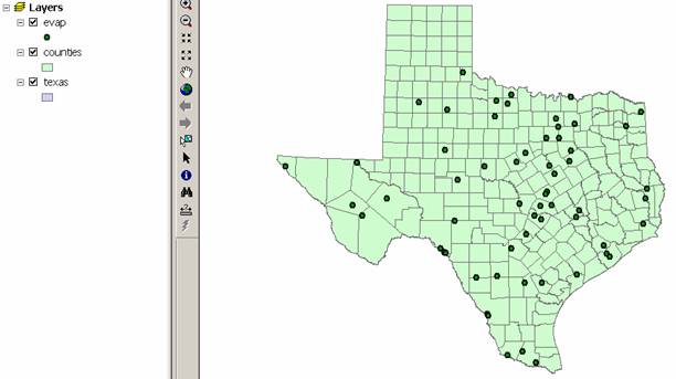
This exercise introduces you to ArcMap and ArcCatalog. You use these applications to create a map
of pan evaporation stations in
Computer and Data Requirements
To carry out this exercise, you need to have a computer, which runs ArcGIS.
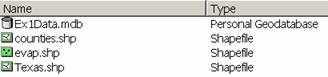
You will be working with the following spatial datasets during this exercise:
- A polygon shapefile of the
counties of
- A point shapefile of pan evaporation stations, called Evap
- A polygon shapefile of the
state of
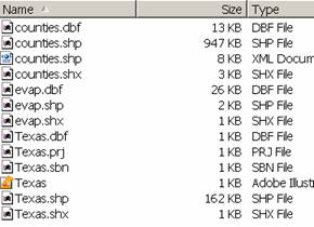
These shapefiles consist of several files (e.g. evap.dbf, evap.shp, evap.shx). You can get them from this Winzip file: ex12003.zip, which you have to unzip using the Windows utility Winzip. For UT Austin students the files are located on the LRC NT network in the class directory class\maidment\giswr2003\ex1\. This directory can be found in the LRC using Windows Explorer at My Computer\My Network Places\Entire Network\Microsoft Windows Network\lrc\civil5\lrc\class. You need to establish a working account to do the exercise on. This can be in c:\temp or in the diskette or zip disk drive of the machine you are working on. If you don't yet have a regular NT Login account at the LRC, get a temporary guest login to do the exercise. If you use the Winzip file, double click on the Winzip file and you should see the Winzip or the Alladin Stuffit utility open on your computer (if it doesn’t open you’ll have to unzip this file on a computer with Winzip or Alladin Stuffit operational). If queried, agree to use the Winzip system, then you’ll be presented with a list of the files inside the Winzip folder. Use Action/Select All to select all these files, then Action/Extract to extract them to the working folder that you’ve set up to do this exercise. You should end up with a file list that looks something like this. You may see these data within a sequence of folder names, and if so, click on each folder down through the sequence until you locate the required files.
ArcGIS
License Server
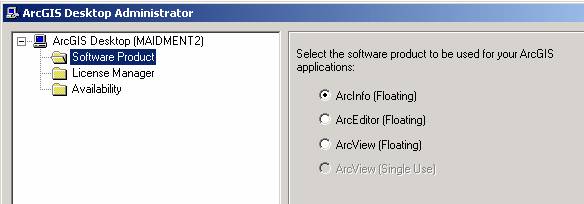
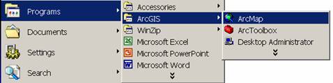
This exercise can be executed with any of the options within ArcGIS, namely ArcInfo, ArcEditor or ArcView. Each of these systems provides access to ArcMap and ArcCatalog, which are the ArcGIS interfaces used to do the work. When you invoke ArcMap or ArcCatalog, it is possible that you will get a message saying that all the licenses for ArcInfo are in use on the network, or that you aren’t licensed for this application. In that event, you need to switch to another version of the software with available licenses. To do this, from Windows use Start/Programs/ArcGIS to invoke the ArcGIS Desktop Administrator, and select another version. In the LRC, ArcView [Single Use] works best, but in another lab setting, the ArcView [floating] or ArcEditor [floating] could be the right choice, depending on license availability.

Procedure
Please note that the following procedure is a general outline, which can be followed to complete this lesson. However, you are encouraged to experiment with the program and to be creative.
1. Viewing Shapefiles
A shapefile is a homogenous collection of simple features that do not contain topological information. The format was introduced with ArcView 2.0 to simplify the representation of spatial data. A shapefile includes geometric features and their attributes. The attributes are contained in a dBase table, which allows for the joining with a feature based on the attribute key.
Viewing Shapefiles in ArcMap
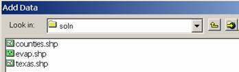
(1) Open ArcMap and select the A new empty map option.
(2) Use the ![]() (Add Data)
button to add the exercise data for this exercise. Navigate to the folder,
which contains the data, and select all three files at once by using the shift
key. Click the Add button to import the images. If you are using a network drive to obtain
your files use the
(Add Data)
button to add the exercise data for this exercise. Navigate to the folder,
which contains the data, and select all three files at once by using the shift
key. Click the Add button to import the images. If you are using a network drive to obtain
your files use the ![]() button to add the network drive to the ones
that ArcMap is accessing so you can get to the files.
button to add the network drive to the ones
that ArcMap is accessing so you can get to the files.
In ArcMap, a layer consists of a reference to a spatial dataset (such
as a feature class, shapefile or coverage) and a definition of how to display
it (legend colors, line thickness, etc.), and a map is a graphical
representation of geographic information. The left panel in the ArcMap window
is the Table of contents, and the right panel is the Display window. The Table
of contents lists layers, and the Display window displays maps. You
may get a message that says that “one or more layers lacks spatial
reference information and can’t be projected”. Don’t worry about this. The
(3) Click off the check marks next to the layer names in the left hand column. Click on each layer name individually to that you may view what features that layer contains.
When you are done exploring the possibilities of ArcMap, exit the program. You do not need to save the file since you will be coming back to ArcMap later in the exercise.
Preview Shapefiles in ArcCatalog
(4) Open ArcCatalog
(5) On the left panel, search for the folder where the exercise data is located.

In ArcCatalog, you can toggle the right panel display between a file tree (Contents tab), a data view (Preview tab), and a metadata document (Metadata tab).
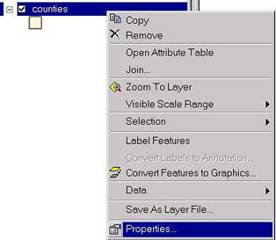
(6) Highlight the layer for the Counties shapefile and click on the Preview tab in the right panel. First look at the Geography preview.
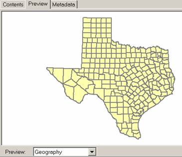
You can see the layer represents the outline of
If you click on the Metadata tab, you’ll see descriptive information about the Counties layer:

Click on the other two data layers to preview them also.
2. Creating Geodatabases, Feature Datasets, and Feature Classes
A geodatabase is a relational database that stores geographic information. A relational database is a collection of tables logically associated with each other by common key attribute fields. A geodatabase can store geographic information because, besides storing a number or a string in an attribute field, tables in a geodatabase can also store geometric coordinates to define the shape and location of points, lines or polygons. Note that a single table can store only one type of spatial feature (point, line or polygon) and not a mixture of feature types. A personal geodatabase is a file with extension .mdb, which is the file extension used by Microsoft Access.
A feature dataset is a collection of feature classes that share the same spatial reference. The spatial reference describes both the projection and spatial domain extent for a feature class in the geodatabase. Because the feature classes in a feature dataset share the same spatial reference, they can participate in topological relationships with each other such as in a geometric network. These topological relationships can also be stored in the feature dataset. Note that feature classes in a geodatabase can exist as stand-alone feature classes, without being part of any feature dataset.
A feature class is a collection of features with similar geometry. There are point, line, and polygon feature classes. Two types of feature classes exist: simple feature classes and topological feature classes. A simple feature class includes features that have no topological associations among them and features maybe edited independently of each other. Topological feature classes are bond as one integrated topological unit, such as a geometric network that we’ll explore later in this class.
Create a new Geodatabase
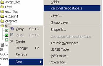
(1) To create a new geodatabase in Arc Catalog first right click on the folder that contains the data for the exercise. Select New/Personal Geodatabase and a new geodatabase -- called New Personal Geodatabase.mdb and represented by an icon with the shape of a cylinder -- will be created,
and (2) name the geodatabase Ex1Data (the geodatabase will keep its file extension mdb regardless of whether you included it in the name or not). You can right click on the geodatabase name and use Rename to rename the file if necessary.
Adding Data to the Geodatabase
When first loading data into a geodatabase, it is important to think about the data and how they are related. As mentioned above, in geodatabases the data is placed in feature classes that are then organized into feature datasets. A geodatabase can have one or more feature datasets. Each feature dataset has a single reference frame, which includes the map projection and map extent. It is possible to define the reference frame after the creation of the feature dataset and before data is loaded. There is a simpler method to be certain that your entire data will be completely contained in a feature dataset. When you load data into a feature dataset, the first feature class loaded dictates the reference frame of the dataset. Therefore, you simply load the shapefile or coverage, which covers the largest extent, and all your data will be in the correct reference frame.
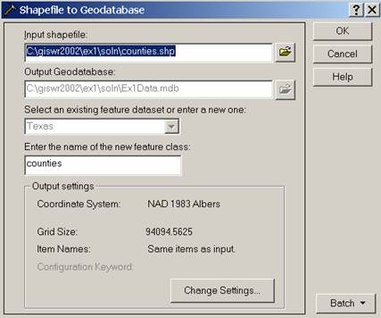
To add data to the Ex1Data geodatabase within a feature dataset, in
ArcCatalog: (3) right-click on the name or icon of Ex1Data, select Import/Shapefile
to Geodatabase, browse for the shapefile Texas and click to convert
it. Type the name
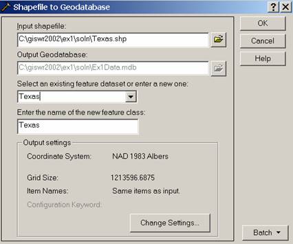
Click Ok and a new feature dataset called
We have actually done something rather clever here, which is that we have
defined a spatial reference frame for the feature dataset

___________________________________________________________________________
Helpful Tip:
This information is actually stored in text format in the file Texas.prj, which is part of the shape file set that you opened at the beginning of this exercise. You can open this file with Notepad or Word and rearrange the contents to appear as below (don’t save the file in any rearranged format or it may not work correctly later):
PROJCS["NAD_1983_Albers",
GEOGCS["GCS_North_American_1983",
DATUM["D_North_American_1983",
SPHEROID["GRS_1980",6378137.0,298.257222101]],
PRIMEM["
UNIT["Degree",0.0174532925199433]],
PROJECTION["Albers"],
PARAMETER["False_Easting",1000000.0],
PARAMETER["False_Northing",1000000.0],
PARAMETER["Central_Meridian",-100.0],
PARAMETER["Standard_Parallel_1",27.41666666666667],
PARAMETER["Standard_Parallel_2",34.91666666666666],
PARAMETER["Latitude_Of_Origin",31.16666666666667],
UNIT["Meter",1.0]]
This information defines the earth datum (NAD 83), map projection (Albers
Equal Area), and coordinate system possessed by the
If you check the file list for the shape files that you opened at the
beginning of this exercise, you’ll find that the Texas shape file is the
only one that has a .prj file and the Counties and Evap shape files
don’t have a .prj file, which means that they have a coordinate system
but it is undocumented in your dataset.
It happens that these shape files have the same coordinate system as the
___________________________________________________________________________
Ok, lets continue with the exercise.
Import the other shape files for Counties and Evaporation to the feature
dataset in a similar way that you just did for the
and click Ok, and Counties will be added to the
Repeat the process for the shapefile Evap, but in this case name the new
feature class Evap, and click Ok. The
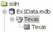
After creating the geodatabase, the feature dataset and the feature classes, the ArcCatalog tree looks like this:
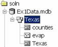
Note that the feature classes
3. Displaying Feature Datasets in a Map
We will now add the feature dataset that we created in
ArcCatalog to an ArcMap document. To display the spatial data of the
(1) You can launch ArcMap from within ArcCatalog:
![]()
or you can open ArcMap from the Start menu as you did before. Click on
the Add Data button, ![]() .
.
(2) Browse to the feature dataset 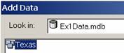 and click Add.
This has the effect of adding all the feature classes in the feature dataset to
the ArcMap display. You can add individual feature classes within the
and click Add.
This has the effect of adding all the feature classes in the feature dataset to
the ArcMap display. You can add individual feature classes within the
Note that the Table of contents lists the layers corresponding to the three
feature classes of the

(3) Save your work in ArcMap by choosing File/Save and, after
navigating to your working directory, naming the file Ex1 (the file will
be assigned the extension mxd). When
you do this, the Ex1.mxd file contains the file location of the geodatabase and
the symbology you’ve chosen for the map display. You can shut down Arc Map and then invoke Arc
Map again and reload the same map display by clicking on Ex1.mxd. Note, however, that if in the mean time
you’ve relocated your geodatabase, ArcMap will go back to where you had
it at the time the map file was saved.
________________________________________________________________________
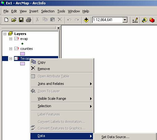
Helpful Tip:
If you see a red exclamation points beside your feature classes, in ArcMap, right click on the feature class use Data/Set Data Sources to relocate the file location where the corresponding data are now stored and your map will display correctly again. It does not matter where the Ex1.mxd file is stored, you can move that around wherever you want, but it does matter where the data referred to in that file are stored.
________________________________________________________________________
Ok, lets continue on with the exercise.
(4) To change the appearance of a map display, you can access the Symbology menu just by double clicking on the Symbol displayed in the ArcMap Layer Table of Contents.

Click on the symbol color box, make your selections for the Fill Color
and the Outline Color, and click OK, twice. Follow this procedure to
modify the display of the Evap layer. Hopefully, the new map looks better than
the original one. You can show the
outline of the State of
More complicated symbol shading that has the color and size of the symbols varying according to attributes of a feature class, can be manipulated by accessing the Symbology tab of the Properties of the Feature Class.
4. Accessing and Querying Attribute Data
Numerical and text information stored in the fields of the geodatabase tables are called attributes. To access attribute data of the feature classes at a specific location, in ArcMap: make visible the layers Evap and Counties (assuming you want to retrieve information of both layers) by clicking on Evap and then holding down the shift key select the Counties file.
(1) Click on the Identify Features tool ![]() which is contained within the
“Tools” menu. If you
don’t see this set of tools on your ArcMap document, use View/Toolbars
and click on Tools to make it appear.
which is contained within the
“Tools” menu. If you
don’t see this set of tools on your ArcMap document, use View/Toolbars
and click on Tools to make it appear.
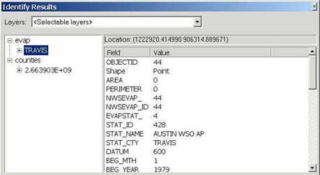
(2) Click on the location on the map you are interested in, and in the Identify
Results window, select the object you are interested in. In the figure,
attribute data for the
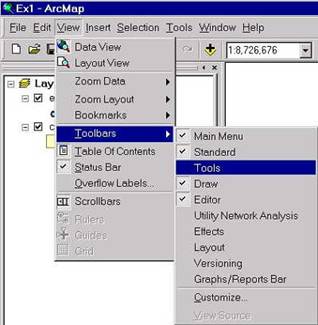
If you inadvertently close the Tools menu you just used, you can open it again from the View menu:
Viewing an Attribute Table
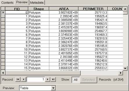
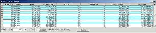
(3) To access attribute data of an entire layer, in ArcMap: right click on the Evap layer name in the table of contents, and select Open Attribute Table:
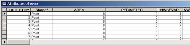
Tables that contain attribute data of a layer are always called Attributes of <layer name>, and contain a field called Shape. The field Shape displays the words Point, Line or Polygon, but it really stores a geometric object with the shape of a point, line or polygon.

Note that record with ObjectID 44 (indicated by the blue selection in the
table) corresponds to
(4) To Clear a Selected feature and select a new one, use: Selection/Clear Selected Features in the ArcMap toolbar:
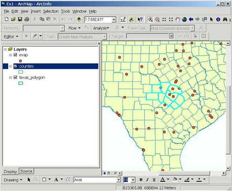
5. Selecting features from a feature class (points, lines and polygons)
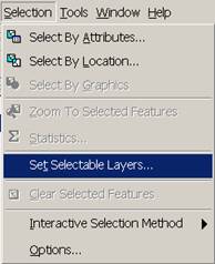
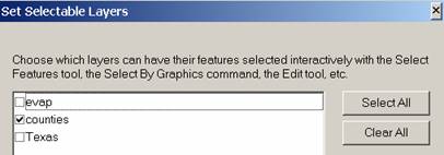
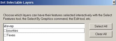
Selecting features from a feature class involves choosing a subset of all the features in the class for a specific purpose. Feature selection can be made from a map by identifying the geometric shape, or from an attribute table by identifying the record. Regardless of how you select an object, both the shape in the map and the record in the attribute table will be selected. To choose a particular data layer for selection use Selection/Set Selectable Layers and then click off the layers that you don’t want to have selected. Be careful when using this Set Selectable Layers function because if you later want to select features from another class, you’ll have to go back and change this selection to your new class.
(1)
To select an object from the map, in ArcMap: click on
the Select Features tool ![]() , in the
Tools menu
, in the
Tools menu
(2) Click on the Counties polygons you want to select. To select more than one object, press the Shift key and hold it down while you click on the additional objects. Selected objects are displayed with a light blue outline, although the color might change depending on your settings. The corresponding attribute table records have also been selected. You can verify this by opening the Counties attribute table.
(3) To clear your selection, right click on the layer name, and choose Selection/Clear
Selected Features.
(4) To select an object from the attribute table, in ArcMap: (a) in the table of contents, click on the layer name Counties, (b) select Open Attribute Table, (c) in the Attribute Table, click on the square at the left of the records you want to select. To select more than one record, press the Ctrl key and hold it down while you click on the additional records. Selected records are displayed with a light blue background, although the color might change depending on your settings. The corresponding objects in the map have also been selected. You can verify this by returning to the map window.
To clear your selection, click on the Options button of the attribute table window, and choose Clear Selection.
6. Making a Chart
Charts are useful because they allow you to visualize trends in data. ArcMap has chart-making capabilities. We will plot a chart of one or more records selected from a geodatabase table.
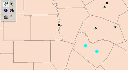
(1) Use Selection/Set Selectable layers to show only the Evap data layer.
Select the two evaporation points that are located in
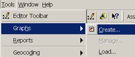
To create a chart, choose Tools/Graphs/Create, this opens the Graph Wizard.
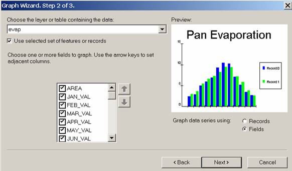
(2) You will be making a Column chart (the default option) so just click on the Next button. The next screen will allow you to indicate the data to be used in the graph. The layer or table you will use is the evap layer. Keep the Use selected set of features or records selected.
(3) Toggle the Fields button next to the phrase Graph data series using the scroll bar on the right hand side of the attribute names. Now you will select the data to be graphed. We will make a graph comparing the evaporation at the stations selected for each month of the year (Jan_Val to Dec_Val). The values shown are the mean monthly pan evaporation in inches.
(4) Choose the monthly values to graph by selected them. Hit the Radio button for Graph data series using “Fields”. Click the Next button.
In the final step of the Graph Wizard you will specify the chart title and other presentation specifics. (5) Give the chart the title Pan Evaporation and label the legend with the attribute STAT_NAME. Play with the Bar gap to change the size of the bar.
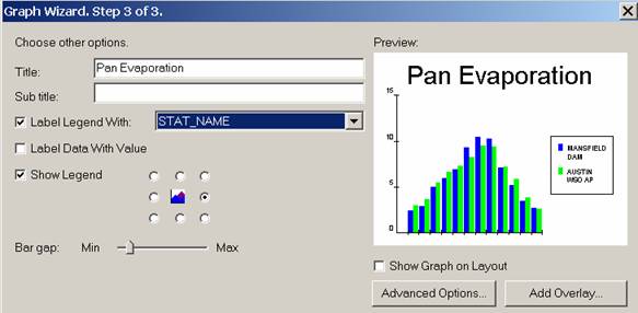
Press Finish. You have created a graph in ArcMap!!
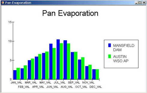
You’ll see that the x-axis has rather inconvenient long labels. That is because those are the field names for these data in the geodatabase and in ArcGIS its not a simple matter to change field names.
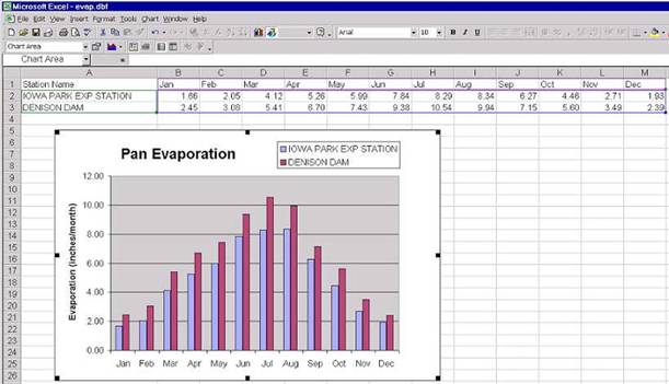
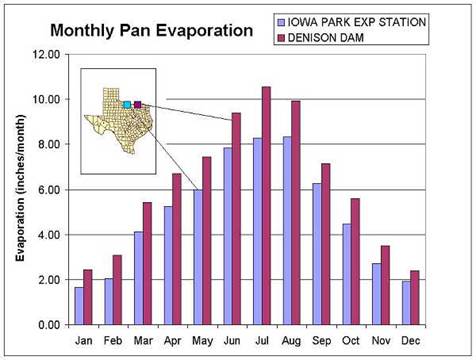
Another option is to make a chart in Excel using the dBase tables given by the evaporation shapefile. Open the evaporation attributes table evap.dbf as a table in Excel. Use Files of Type: dBase files in Excel to focus only on .dbf tables when you open the table. Select the stations you want to plot, copy their records to a new worksheet, delete the columns you don't need there, and then create a chart. Here is an example chart created this way. The column headers have been renamed from Jan_Val to Jan, etc to make the Chart x-axis more attractive to view. The legend has been moved to the top of the chart to allow a wider spacing of the data in the chart.
____________________________________________________________________________
Helpful Tip:
Instead of opening the evap.dbf file in Excel, you could have accessed the same data directly from the geodatabase using Data/Get External Data in Excel
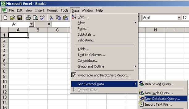
Navigate to the geodatabase and select the table Evap. Then select the fields that you want to appear in the spreadsheet. You’ll end up with a spreadsheet containing the data for all the fields you’ve selected.
Ok, lets continue with the exercise.
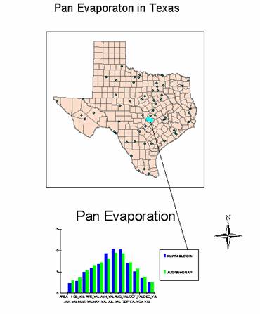
7. Creating a Map Layout
To consolidate a map of counties of

Reduce the size of the data frame in the layout (i.e., rectangle where the
spatial data is contained) -- to make room for the graph -- by clicking on the
graph and moving its handlers. If you have a zoomed in view in Arc
Map, you’ll get the same image in in the Layout. To go back to the image of the whole State of
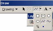
You can draw lines to relate the location of the measurement stations and the data plotted on the graph using the Draw a Line tool from the ArcMap Draw toolbar (to display this Toolbar, use View/Toolbars and select Draw). This draw toobar works the same in ArcMap as it does in other MS applications. Its important to show some association between the data plotted on the chart and where these data were measured on the map so that you can figure out which data series was measured at what location.
Or you can add text with the text tool ![]() shown next
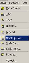
to the line draw tool. You can also insert a North Arrow by using
the Insert menu in ArcMap.
shown next
to the line draw tool. You can also insert a North Arrow by using
the Insert menu in ArcMap.
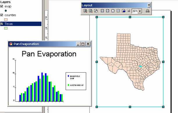
Your final map could look like this:
You can print this map directly from ArcMap, or you can copy it into Word and print it from there. To copy a map into Word, Right Click on the map in the ArcMap Layout, and you'll see an option Copy Map to Clipboard. When you open Word, use the option Edit/Paste Special and you'll get a Window that allows for an ESRI ArcMap Document Object. If you hit OK here, then your map will paste right into Word as it looks in ArcMap!
Here's another option: suppose you want to take a chart in Excel and add a map to the Chart to show where the data apply. If you Copy the Map to the Clipboard in ArcMap, you can Paste it in Excel and annotation to connect the map to the Charted data. You can see that in this map, a nice color association between the symbols on the map and the bars on the chart makes it clear which data series was measured at which location.
The manipulations just described transfer objects from one application to another.
___________________________________________________________________________
Helpful Tip:
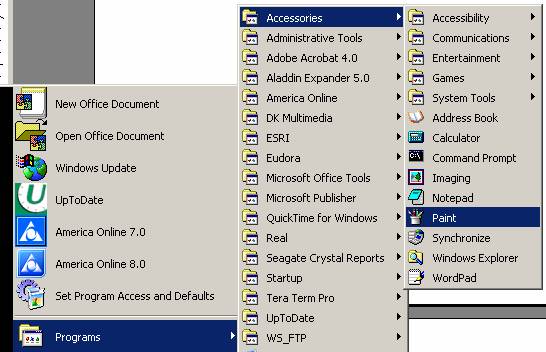
A more general procedure is to simply copy the screen to the clipboard and cut out the part that you want, saving it to a file for later use. That is how all the images in this exercise were prepared. To copy any image, hit Shift/Print Screen on your keyboard (this copies the Screen onto the Clipboard). From the Start Menu in Windows, Open Accessories/Paint.
Here’s how your map display may appear in Paint:
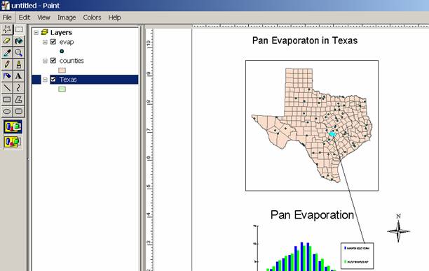
In Paint, use File/New to select a new file, then Edit/Paste
to paste the contents of the Clipboard into Paint. If asked whether you
want to enlarge the bitamp say Yes.
You'll now see an image of all the things on your original computer
screen. Click on the open box ![]() under Edit so that the cursor becomes a cross
and use it to draw a dashed box around the portion of the image that you want
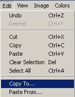
to keep. Use Edit/Copy To to save the file as a .bmp bitmap
file.
under Edit so that the cursor becomes a cross
and use it to draw a dashed box around the portion of the image that you want
to keep. Use Edit/Copy To to save the file as a .bmp bitmap
file.
Then in Word, you can use Insert/Picture/From File to insert the .bmp file into Word. Note that in ArcMap you can use Insert/Picture to similarly insert pictures into your maps!! Very cool!
___________________________________________________________________________
Ok, lets continue with the exercise.
8. Do Something Creative
Now that you are familiar with the operation of ArcGIS, make some new maps in places that are of interest to you. Some additional data showing precipitation, temperature, and net radiation values for the whole world on a 0.5° mesh, can be found in http://www.ce.utexas.edu/prof/maidment/giswr2003/ex1/txclim.zip or in the Climate folder in the same place in the LRC class folder from which the original data for this exercise were obtained.
To Be Turned In: A completed map and chart of selected data.
These materials
may be used for research and educational purposes only. Please credit the
authors and the
Center for Research in Water Resources at The
All commercial rights reserved. Copyright 2003 Center for Research in Water Resources.