The Geostatistical
Analyst
Prepared by Jon
Goodall and
September 2002
Contents
- Introduction to Spatial Interpolation
- Basics of Kriging
- Case Study: Estimating Fecal Coliform in Galveston Bay, Texas
Introduction of Spatial Interpolation
A very basic problem in spatial analysis is interpolating a spatially continuous variable from point samples. In hydrology, precipitation is often measured only at rain gages, yet the engineer is interested in estimating the total rainfall over a watershed. The question is how to weight the individual rain measurements to obtain the best estimate of rainfall at an unmeasured location (Figure 1).

Figure 1 The interpolated value at the unmeasured yellow point is a function of the neighboring red points (From ArcGIS Help Menu).
One common solution to the spatial interpolation problem is the Inverse Distance Weighting (IDW) method. In Figure 1, the yellow point can be estimated as the sum of all neighboring locations (the red points) times a weighting factor that is a function of the distance between the yellow and the red points (Eq 1).
![]() (1)
(1)
IDW is often an very
good interpolation method and is relatively ease to understand and
reproduce. The algorithm used by IDW to
estimate the weighting factors (![]() ),
however, is simplistic and can be improved upon by taking a more statistically
sound approach to parameter estimation.
This is where kriging comes in.
),
however, is simplistic and can be improved upon by taking a more statistically
sound approach to parameter estimation.
This is where kriging comes in.
Basics
of Kriging
Kriging was developed in the 1960s by the French mathematician Georges Matheron. The motivating application was to estimate gold deposited in a rock from a few random core samples. Kriging has since found its way into the earth sciences and other disciplines. It is an improvement over inverse distance weighting because prediction estimates tend to be less bias and because predictions are accompanied by prediction standard errors (quantification of the uncertainty in the predicted value).
The basic tool of geostatistics and kriging is the semivariogram. The semivariogram captures the spatial dependence between samples by plotting semivariance against separation distance (semivariance will be explained in the next paragraph). The premise of any spatial interpolation is that close samples tend to be more similar than distant samples (this is also called spatial autocorrelation). This property of spatial data is implicitly used in IDW. In kriging, one must model the spatial autocorrelation using a semivariogram instead of assuming a direct, linear relationship with separation distance.
Semivariance equal one-half the squared difference between points separated by a distance d±∆d (assuming no direction preference). As the distance between samples increase, we expect the semivariance to also increase (again, because near samples are more similar than distant samples). This is true, however, only up to some given separation distance. For this distance and up, points are unrelated. Stated another way, if 50m is this critical separation distance, two points separated by 50m are likely to be just as similar (or dependent on one another) as samples separated by 100, 200, 300, or any distance greater than 50m.
Suppose we have the semivariogram shown in Figure 2. What information does the plot provide? Well, the semivariance between samples separated by no distance is about 1.5E-4. This is called the nugget. What it says is that if you measure the variable at locations very, very close to one another, the values measured might be quite different. Why would this happen? Suppose you had a gold nugget in the middle of an otherwise gold-free rock. If you sample just on the edge of the nugget you get a high gold estimate. If you sample just outside of the edge, you get no gold in your estimate. The presence of a nugget in the semivariogram therefore tells you that, assuming no measurement error, the variable is not spatially continuous.
The semivariogram also tells us that points separated by 60,000 m are likely to have the same average difference as points separated by 100,000, 150,000, 200,000 m or any distance above 60,000m. 60,000 m is the range of the semivariogram and suggests the area of influence for any given point. An unmeasured location can be predicted based on its neighboring samples closer than 60,000m. A sample collected 61,000 m away from the sample will likely have no influence on the actual value at the unmeasured location.

Figure 2 The semivariogram is used to model the spatial relationships between samples separated by some distance, d.
For kriging estimation, the semivarogram model (the yellow line in figure 2) is used to obtain estimates for the weighting parameters of Equation 1. This process is done automatically by the geostatistical analyst once the user is satisfied with the semivariogram. If you are interested in the derivation of the weighting parameters (or any of the other topics discussed here), Applied Geostatistics by Edward H. Isaaks and R. Mohan Srivastava is an excellent resource. Or for the more mathematical folks, try Statistics for Spatial Data by Noel A.C. Cressie.
Case Study: Estimating Fecal Coliform in Galveston Bay , Texas
Now that we’ve gotten the basics down, it’s time to apply
our new knowledge of kriging to a practical, real-world problem. The question posed is this: What is the
average concentration of fecal coliform within each segment of
- Step 1: Download the
You’ll see in the map document the 124 measurement stations with the average fecal coliform concentration shown as bars (Figure 3). Notice the spatial pattern? Fecal coliform seems to be higher at the outlet of rivers, perhaps due to the transport of bacteria from upstream point and nonprofit sources.

Figure 3
We are going to use kriging to interpolate biomass continuously over space based on these point samples. First we have to better understand the data through a exploratory spatial data analysis (ESDA).
Exploratory Spatial Data Analysis
Exploratory Spatial Data Analysis (ESDA) is a process of understanding the properties of a spatial dataset in order to best model the data using geostatistics. The word “Explore” should tell you that ESDA is more of an adventure than a strict – you must follow the path at all times – procedure. In this exercise we show how the Geostatistical Analyst tools can be used to understand the population distribution of the attribute of interest and how to understand the large-scale patterns in the dataset through 3D visualization. This is not a comprehensive list of ESDA procedures, but a good start. Through this process, keep in mind that the better one understands the spatial characteristics of the data, the better kriging model one can build to interpolate the data, and, consequently, the better estimates one will produce.
1.
Histogram
- Step 2: If the geostatistical analyst
extension is not added to the map, add it now. Click Geostatistic Analyst à
Explore Data à
Histogram. Choose to use the mean
values for locations with multiple samples.
The Histogram tool allows you to perform mathematical transformations to the data set to create a Gaussian (or normal) distribution from a non-Gaussian raw data set. A Gaussian distribution is desired because kriging assumes that the data are multivariate normally distributed.
- Step3: Set the Layer to
TDHmonitoringstation and attribute to FC_mean. Use a log transformation and 15 bars on
the histogram.
It is difficult to see if the log transformation of mean fecal coliform is normally distributed using the histogram tool in part because of the high number of measurements at the lower detection limit of 2 MPN per 100 ml. The actual value of fecal coliform at these locations is probably less than 2 MPN per 100 ml, and if the true value were known, the log transformation might more clearly resemble a Gaussian distribution.

Figure 4 Histogram of Log(FC_mean).
We’ll leave the histogram tool for now and use a different tool for the distribution analysis: the normal QQ plot.
2.
Normal QQ Plot
Another way to understand the data’s distribution is by using the Normal QQ Plot tool. In a QQ (Quantile-Quantile) plot we test whether data are normally distributed by plotting it against a dataset with a known normal distribution. If the plot is linear along the line Y=X, then the data follow a normal distribution.
- Step 4: Click Geostatistic Analyst à
Explore Data à
The QQ plot shows the linear relationship between log(FC_mean) and the standard normal distribution, except for the lower tail which, due to the detection limit, plots as a horizontal line (Figure 5). The important point to take away from this plot is that within the bounds of the detection limit, fecal coliform follows a log-normal distribution. One can assume that fecal coliform is also log normal below the detection limit, although this cannot be proven with the provided data.
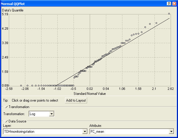
Figure 5 Normal QQ Plot of Log(FC_mean).
Conclusion from distribution analysis: Within the detection limits, fecal coliform follows a log-normal distribution. Keep this in mind because we will return to it when building the kriging model.
3.
Trend Analysis
The trend analysis tool provides a 3D plot of the samples and a regression on the attribute in the XZ and YZ planes. The purpose of the tool is to visualize the data and to observe any large-scale trends that the modeler might want to remove prior to estimation. It is best to keep the kriging model as simple as possible and to only remove a trend if it significantly improves prediction errors.
- Step 5: Click Geostatistic Analyst à
Explore Data à
Trend Analysis. Choose to use the
mean values for locations with multiple samples. View the FC_mean attribute of the
TDHmonitoringstation layer.
The trend analysis tool does show trends in fecal coliform in the X and Y directions (Figure 6). For now we will note this characteristic of the data set but not use it in the kriging model. If one were interested in optimizing the kriging model, removing this trend prior to estimation (then use kriging to predict only the residuals after the trend is removed) is a good place to start.

Figure 6 The trend analysis tool does show some trend in fecal coliform in the X and Y directions as evident by the green and blue regression lines.
4. Other ESDA tools of the Geostatistical Analyst
Other tools exist for exploring the spatial characteristics of the data, but we will not cover them all here. The ArcGIS help menu provides is an excellent resource for understanding and using these other tools to learn about a spatial dataset prior to kriging.
Creating a Prediction Map Using the Geostatistical Wizard
We will now use the knowledge obtained through the ESDA to
build a semivariogram to model the spatial dependence of fecal coliform in
1. Choose Input Data and Method
- Step 1: Click Geostatistic Analyst à
Geostatistical Wizard. Set the Input
Data to TDHmonitoringstation and Attribute to FC_mean. Use the Kriging method.
The first step in the Geostatistical Wizard allows you to select the input data layer, the attribute that you want to interpolate, and the method to use for the interpolation (Figure 7). The validation box allows you to input a different set of points where the attribute value will be predicted based on the interpolation model that you develop. We won’t use this option but keep in mind that it is available.

Figure 7 Step 1 of the Geostatistical Wizard: Choose Input Data and Method
2. Geostatistical Method Selection
- Step 2: Click next and choose to use the mean values for locations with
multiple samples. Use Ordinary
Kriging, Prediction Map, Log transformation, and no trend removal.
This is where the information we learned about the dataset in the exploratory spatial data analysis pays off. As you can, there are six types of kriging available and each type of kriging has two to four types of maps (Figure 8). Ordinary Kriging assumes a constant but unknown mean in the dataset, simple kriging assumes a constant known mean, and Universal Kriging assumes a varying mean over space. The other three types of kriging are more specialized and you can read about them in the ArcGIS help menu. As a rule of thumb, it’s best to stay with ordinary kriging unless you have good reason to stray. If you wanted to account for the trends observed in the exploratory data analysis section, for example, you could try Universal Kriging.
Figure 8 Step 2 of the Geostatistical Wizard: Geostatistical Method Selection
3. Semivariogram/Covariance Modeling
- Step 3: Click next. Change Lag Size
to 2500.
We will now model the spatial dependence of fecal coliform with a semivariogram (Figure 9). The lag size controls the size of the bins for grouping samples. If the lag size is too high, you will miss the spatial correlation in the data. If the lag size is too low, you won’t get many pairs of points for the semivariogram. 2500 m is a some what arbitary number. It produces a variogram that clearly shows increasing semivariance with increasing separation distance. This doesn’t mean that 2400 or 2600 m won’t produce a better model. Modeling the semivariance is an iterative process. You try one model, note the results from that model, and then try to improve upon the results by manipulating the parameters of the model. What you’ll find is that many of the parameters do not influence the model results but a few will. This is true of most model calibration exercises.
Figure 9 Step 3 of the Geostatistical Wizard: Semivariogram/Covariance Modeling
4. Searching Neighborhood
- Step 4: Click next. Keep the
default values.
This forth step of the wizard shows how fecal colifrom will be estimated at all points within the study region. You can click on the map to move the cross hairs and see how the point you clicked will be predicted. Samples highlighted red will have most influence the estimate (because they are closest). Those points not colored will have no influence on the estimate. The circle shows the area of influence according to the semivariogram (the range of the semivariogram as discussed previously). You have the option of including more neighbors in the estimate and how to split the search area. In Figure 10, there must be at least 2 and at most 5 points in each quadrant of the circle. The estimated values at the selected location is 6.7007 MPN per 100ml of fecal coliform.
Figure 10 Step 4 of Geostatistical Wizard: Searching Neighborhood
5.
Cross Validation
- Step 5: Click next.
The finial step of the geostatistical wizard is cross validation of the model (Figure 11). To produce this data, the Geostatistical Wizard uses the semivariogram to predict a value at each measured location as if that measured location was not part of the dataset. By doing so, the model produces estimates at each measured location providing an idea of the model’s accuracy. There are four plots included in the cross validation. The predicted chart (Figure 11) shows that the model does relatively well for small measurements but tends to underpredict larger estimates. A nice feature of the wizard is that you can save the cross validation results to a dbf file and then open them in EXCEL and make your our plots (too bad you can’t do the same with the semivariogram data).
Figure 11 Step 5 of the Geostatistical Wizard: Cross Validation
- Step 6: Click Finish and then OK.
The geostatistical wizard just produced a layer from the model you developed. The layer has predictions of fecal coliform for the extent of the measurements and should look like Figure 12. How does the predicted surface look to you? Does it capture the observed highs and lows?

Figure 12
The map of predicted fecal coliform for the extent of observations in
Understanding and Using the Results
We just created a kriging model that produced a map of fecal coliform over the study area. One obvious question is how good is the map? Are we more confident of our predictions in some areas compared to others? We can answer this question by producing a mean prediction error map.
1. Creating a Mean Prediction Error Map
There are two ways to create a prediction standard error map. First, you can use the geostatistical wizard just as was shown in the previous section, expect that in step 2 you select to create a prediction standard error map instead of a prediction map. This requires you to model the semivarience again (something you probably want to avoid). A faster way to create a prediction error map by using the prediction map you just created.
- Step 1: Right-click on the Ordinary
Kriging layer and choose Create Prediction Standard Error Map (Figure
13).

Figure 13 How to create a prediction standard error map from a prediction map.
The ability of kriging to produce a prediction standard error map is what separates it from other spatial interpolation methods (like inverse distance weighting). With the prediction standard error map, one can clearly communicate the uncertainty in the predicted fecal coliform map.
2. Aggregating the Prediction Map for Each Waterbody (Block
Kriging)
It is now time to revisit our original question and the
motivation for this study. What is the
average fecal colifrom for each segement of
First extend the prediction map to cover the extent of the water body layer
- Step 2: Right-click on the Ordinary
Kriging layer à
Properties. Choose the Extent tab
and set the extent to “the rectangular extent of Waterbody” (Figure
14). Click OK.

Figure 14 Setting the extent of the prediction map to the extent of the Waterbody layer
Next, convert the layer file to a raster file.
- Step 3: Right-click on the Ordinary
Kriging layer à
Data à
Convert to raster. Choose a cell
size of 100. Select your working
directory to store the result and then click OK. This step may take a few minutes.
Finally, Perform zonal statistics to calculate the average fecal coliform for each Waterbody feature.
- Step 4: Add the Spatial Analyst to the
map (if it has not already been added).
Click Spatial Analyst à
Zonal Statistics. Set the input
information as shown in Figure 15 with the exception of the Output Table
field. Set the Output Table field
to your working directory and name the file whatever you’d like. Click OK.

Figure 15 Zonal Statistics Interface for summarizing the interpolated fecal coliform over each Waterbody feature.
The results of the zonal statistics will automatically pop-up once the procedure has completed. The table created will also be automatically joined with the water body table. To visualize the results, we are going to symbolize the Waterbody features according to their average fecal coliform.
- Step 5: Right click on the Waterbody layer and choose properties. Select the Symbology tab and set the fields as shown in Figure 16.

Figure 16 Defining the symbology for the Waterbody layer to show average fecal coliform per Waterbody feature.
The results should look something like Figure 17. Are the estimates of average fecal coliform for each bay that we get through kriging necessarily better than what we would get by simply averaging the observations for each bay segment? One would think so because the point samples may be clustered around locations of high fecal coliform, since high bacteria is more important to health officials than low bacteria. Kriging, like other spatial interpolation methods, tries to take the locations of samples into account for estimating the average values over some region with clustered sampling stations.

Figure 17 Average fecal coliform for the waterbody features.
You’ve just estimated the concentration of fecal coliform
for each bay segment of